


When it comes to decorating your home, a gallery wall is one of the most personal and impactful statements you can make. Yet despite all the thought that goes into selecting the perfect photos and artwork, one crucial element is often overlooked: the color scheme. Without a cohesive color palette, even the most beautiful collection of prints can end up looking chaotic or mismatched. Whether you're building a classic photo display or a curated gallery wall inspiration showcase, understanding how color works is the key to getting it right.
Why a Color Scheme is Important for a Gallery Wall
A thoughtfully chosen color scheme is what transforms a random collection of art into a curated display. First and foremost, it creates cohesion — a visual thread that ties each piece together so the wall feels intentional rather than cluttered or jumbled. Without it, the eye doesn't know where to rest, and the overall effect can feel overwhelming rather than inviting.
Color also has a powerful influence on mood. Warm tones like terracotta and gold evoke comfort and energy, while cooler palettes of navy and sage feel calm and refined. Whether you're building a bright, joyful display or a moody, artistic timeline photo wall, the colors you choose will set the emotional tone of the entire space.
Finally, a well-planned color scheme helps tie your gallery wall into the rest of the room's decor, making it feel like a natural extension of the space rather than an afterthought.
How to Choose the Best Color Scheme for Your Gallery Wall
Choosing a color scheme doesn't need to be intimidating. With a few simple approaches, you can find a palette that suits your style and complements your space beautifully. Here are five strategies to get you started.
1. Choose 2–3 Colors
One of the most reliable rules in design is the 2–3 color rule. By sticking to two or three core colors — complemented by neutrals like white, cream, or black — you create a gallery wall that feels curated and balanced without being visually overwhelming. Neutrals act as breathing room between bolder pieces, preventing the wall from feeling too busy.
2. Consider the Room's Decor
Your gallery wall should feel like it belongs in the room, not like it was dropped in from somewhere else. Look around at the existing elements in your space — the rug, throw cushions, curtains, or even the upholstery on a sofa — and pull colors from those details. This approach creates a seamless, integrated look that feels effortlessly put-together.
3. Go Monochromatic
A monochromatic gallery wall — one that relies entirely on varying shades and tones of a single color — is a stunning choice for anyone drawn to a minimalist or artistic aesthetic. Think an all-black-and-white arrangement, or a wall built entirely around shades of dusty blue. Monochromatic schemes work especially well for high-contrast images, where the lack of competing color lets the composition and subject matter take center stage.
4. Choose One Color Family
If a strict monochromatic approach feels too restrained, try working within a single color family while incorporating several different shades. For example, pairing deep emerald green with pops of sage and olive creates a wall that feels cohesive but layered with visual depth and interest. This technique gives you more flexibility than a monochromatic scheme while still keeping everything harmonious.
5. Bright and Bold
For something more daring, lean into contrasting colors — think deep navy paired with burnt orange, or punchy red alongside warm pink. This kind of bold, dopamine-inducing palette is perfect for those who love colorful home decor, but it's also a brilliant starting point for anyone who wants to inject personality into an otherwise neutral room. Because a gallery wall is relatively easy to update, it's a low-commitment way to experiment with bolder color choices.
How to Put Together a Gallery Wall Color Scheme
Once you've settled on a palette, it's time to bring it to life. From planning your layout to perfecting the finishing details, here's how to assemble your gallery wall with confidence. For a broader overview of the process, our gallery wall guide covers everything you need to know.
1. Plan Your Layout
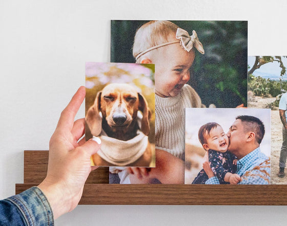
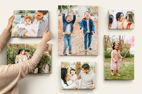
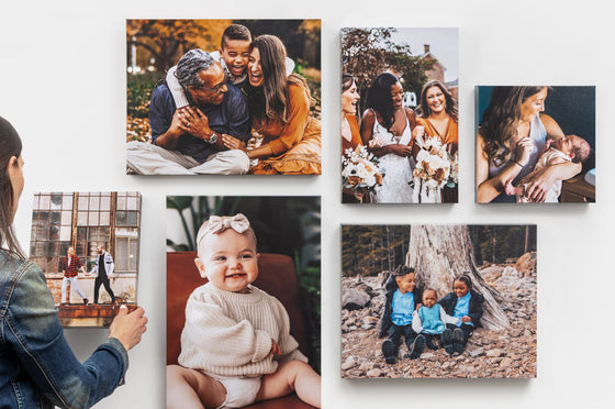
Before a single nail goes into the wall, lay everything out on the floor. Arrange your professional Photo Prints, frames, and any other pieces you're planning to include, then step back and assess the color balance. If one section feels too heavy or a particular print looks out of place, adjust accordingly. If you're adding to or modifying an existing display, Canvas Photo Tiles are a particularly handy option — they're lightweight, easy to reposition, and won't damage your walls.
2. Maintain Consistent Spacing
The difference between a gallery wall that looks curated and one that looks cluttered often comes down to spacing. Keeping consistent gaps between each piece — typically around 2–3 inches — creates a sense of order and intention. To maintain visual balance, place larger, heavier pieces toward the center of the arrangement and let smaller items fill out the edges.
3. Add Variety
A mix of sizes, orientations, and formats keeps the eye moving and adds energy to the display. Combine landscape and portrait orientations, and consider varying the scale from statement pieces to smaller accents. Check out our wall art size guide for help figuring out the right proportions for your space.
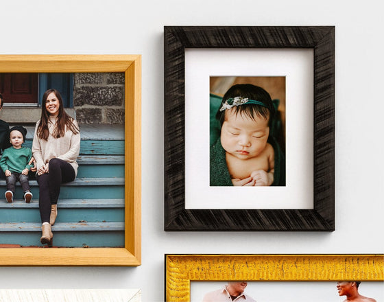
4. Use the Same Frame Styles
If you're after a clean, uniform look, sticking to the same color and style of frame across all your pieces is the most effective approach — even if the artwork itself varies significantly in style. For a more eclectic feel, you can flip this: mix frame colors and finishes, but keep the artwork more consistent in theme or palette. Explore the range of Framed Prints available to find options that suit your vision.
5. Utilize Dark Walls
Don't underestimate the power of a dark accent wall. Deep shades like charcoal, forest green, or navy provide a dramatic backdrop that makes artwork pop, and they naturally guide your color choices — warm metallic tones, rich jewel shades, and high-contrast black-and-white pieces all look exceptional against a dark background.
6. Integrate Textures
Texture adds another layer of cohesion to your gallery wall. Consider pairing gold or metallic frames with artwork that features metallic tones woven through it, or combining wooden frames with pieces that incorporate natural, earthy elements. Metal Prints are ideal for a sleek, modern look with a reflective quality, while wood Block Prints bring warmth and a tactile, organic feel to the arrangement.
7. Edit, Edit, Edit
Once your layout is planned — either on the floor or up on the wall — step away and come back with fresh eyes. It's much easier to spot pieces that feel slightly off, or that would work better in a different position, after a short break. Remove anything that doesn't quite align with the color scheme or disrupts the overall balance. Keep refining until you're completely happy with the result.
Conclusion
Creating a gallery wall that truly sings comes down to one thing: intention. By choosing a clear color scheme — whether that's a bold contrasting palette, a soothing monochromatic arrangement, or a family of complementary shades — you give your display the cohesion it needs to feel considered and complete. Pull from your room's existing decor, experiment with texture and frame styles, and take the time to edit until every piece earns its place. Ready to get started? Browse our full range of wall decor to find the perfect pieces for your gallery wall.