Monitor calibration and color management can be an intimidating and befuddling endeavor. The endless variety of software options, monitors, and calibration equipment can really make you want to rip the hair out of your head. I'm here to quell those fears and answer those questions. Let's get started:
1. Invest in a Quality Monitor.
Here's a little secret: 90% of color management is having a properly calibrated monitor; that's it! By purchasing a decent monitor, calibration puck, and software, one is capable of achieving neutral gray. A neutral gray is the foundation upon which color management is built, so once a neutral gray is achieved, all the other colors will fall in line.
There is a bevy of choices out there in regards to monitors and calibration software. Let's begin with monitors. If you enjoy adjusting and manipulating your files in Photoshop or Lightroom and are a stickler for color accuracy, then you are going to want to drop a little coin on a monitor. You should look to be spending in the range of $800 to $2,000.
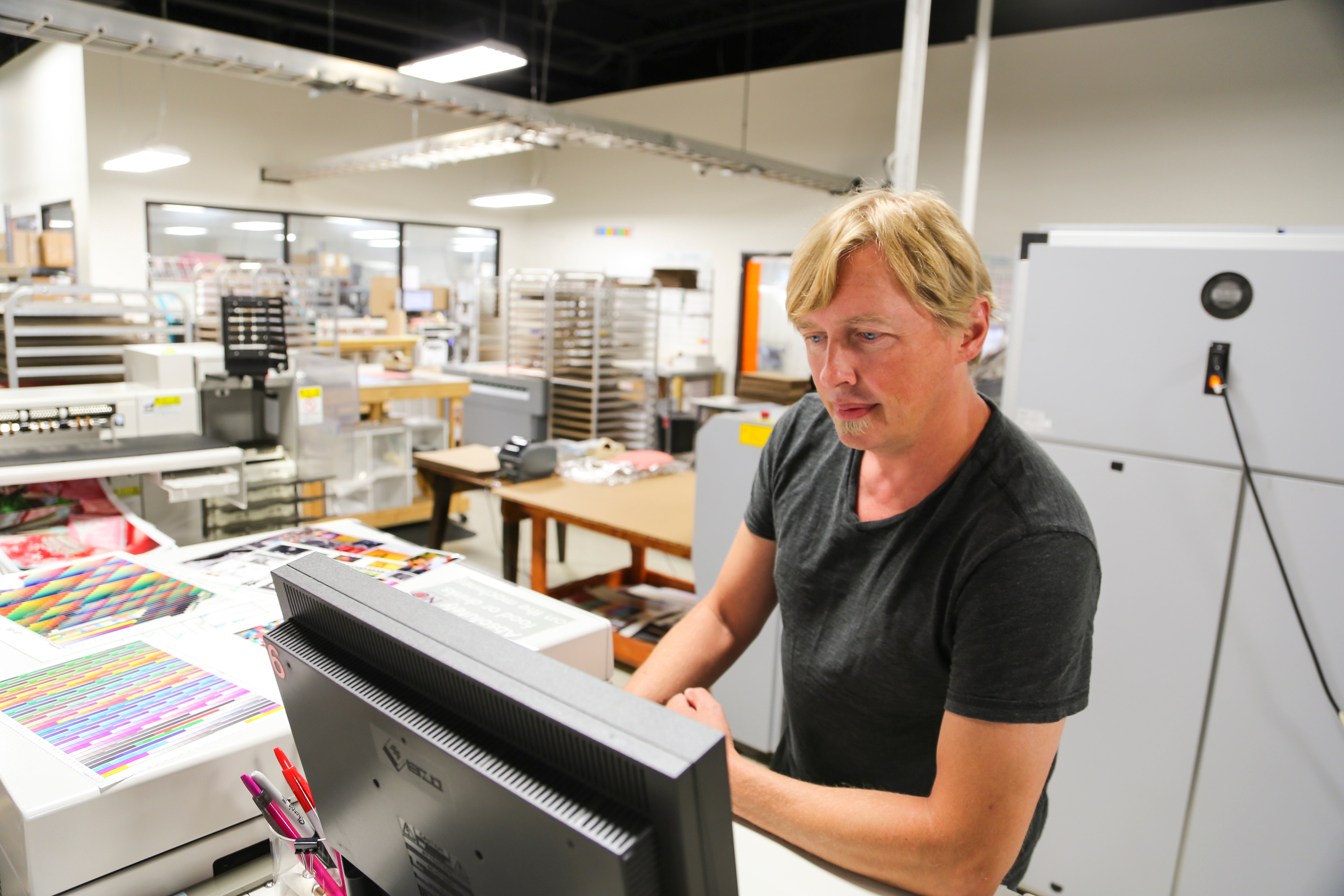
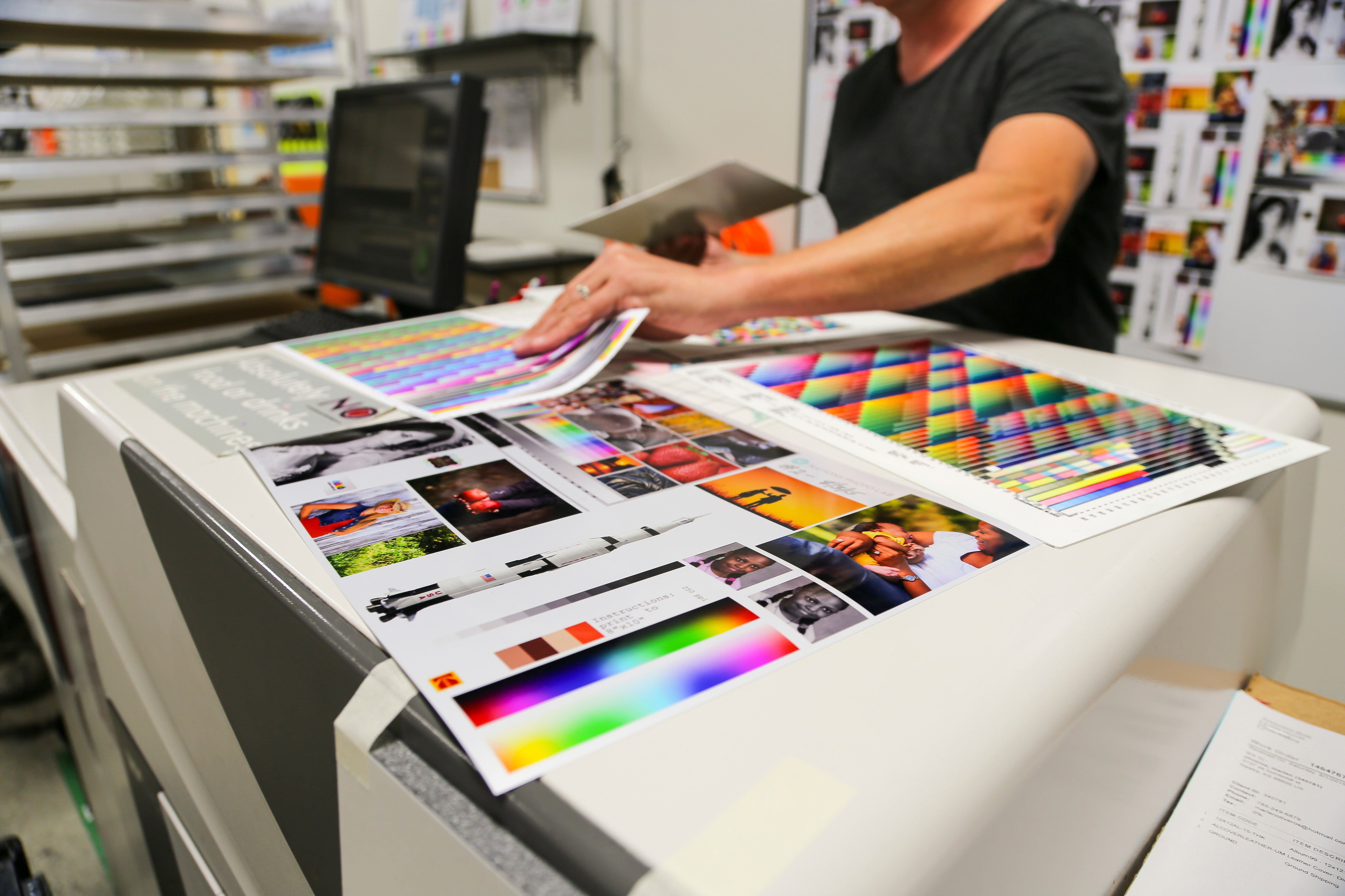
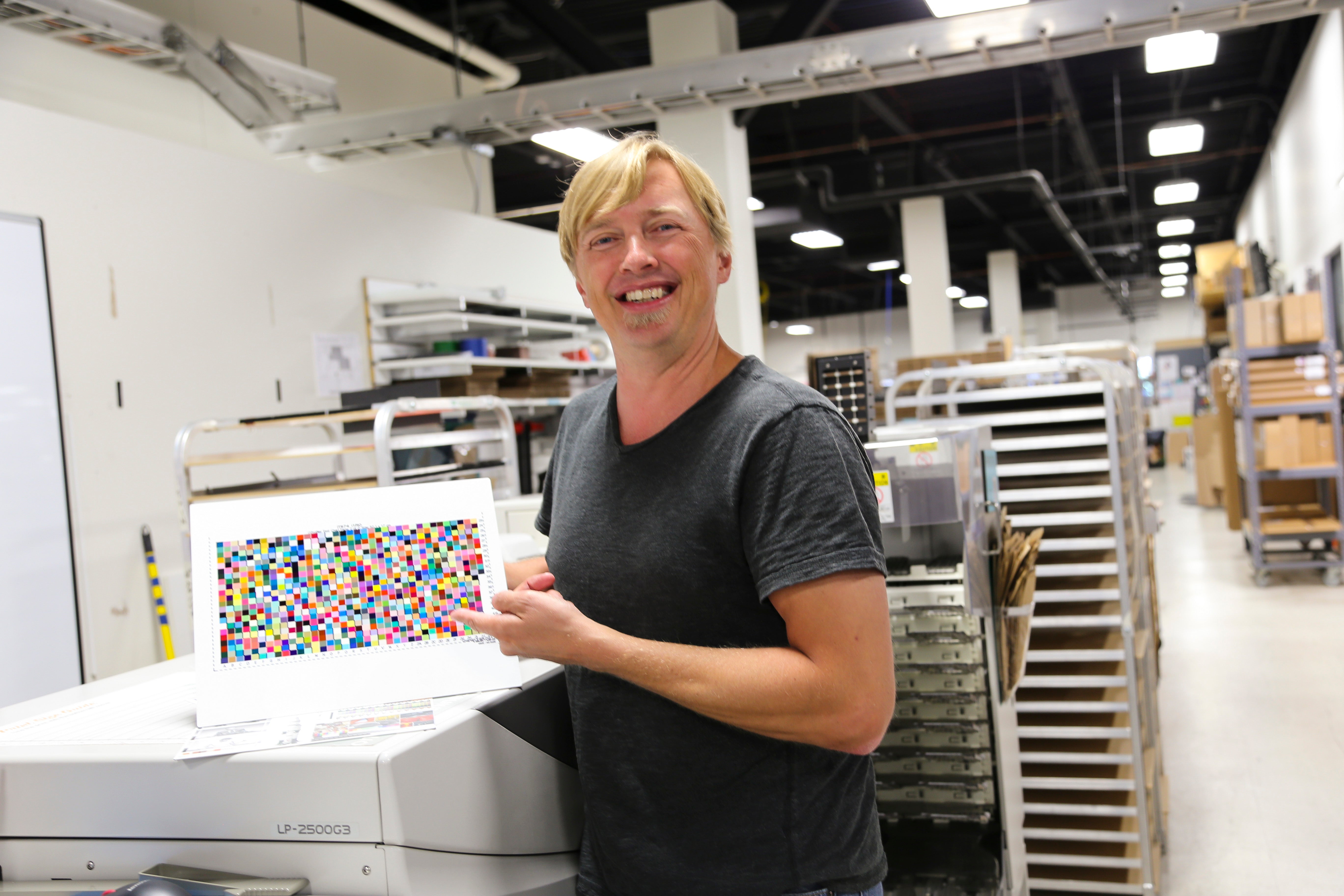
Here at NPL, our color correction experts use Eizo ColorEdge CX271 LED monitors. We have found that in the world of silver halide photo printing that LCD monitors rendered more accurate density and color matching. When we compare the file on screen with the output print, it is spot on. The Eizo monitors we use cost about $1,400.
A lot of photographers and designers use their laptops or Apple cinema display. I have an Apple display at home, and the one concern I've had with the Apple cinema display is how vibrant images can appear; the surface of the display has such pop and shine. Bright reds and oranges show great detail that is often beyond the gamut of the silver halide print. This is where having our printer-specific ICC profiles will help any photographer attain color match accuracy and consistency.
2. Choose the correct calibration software.
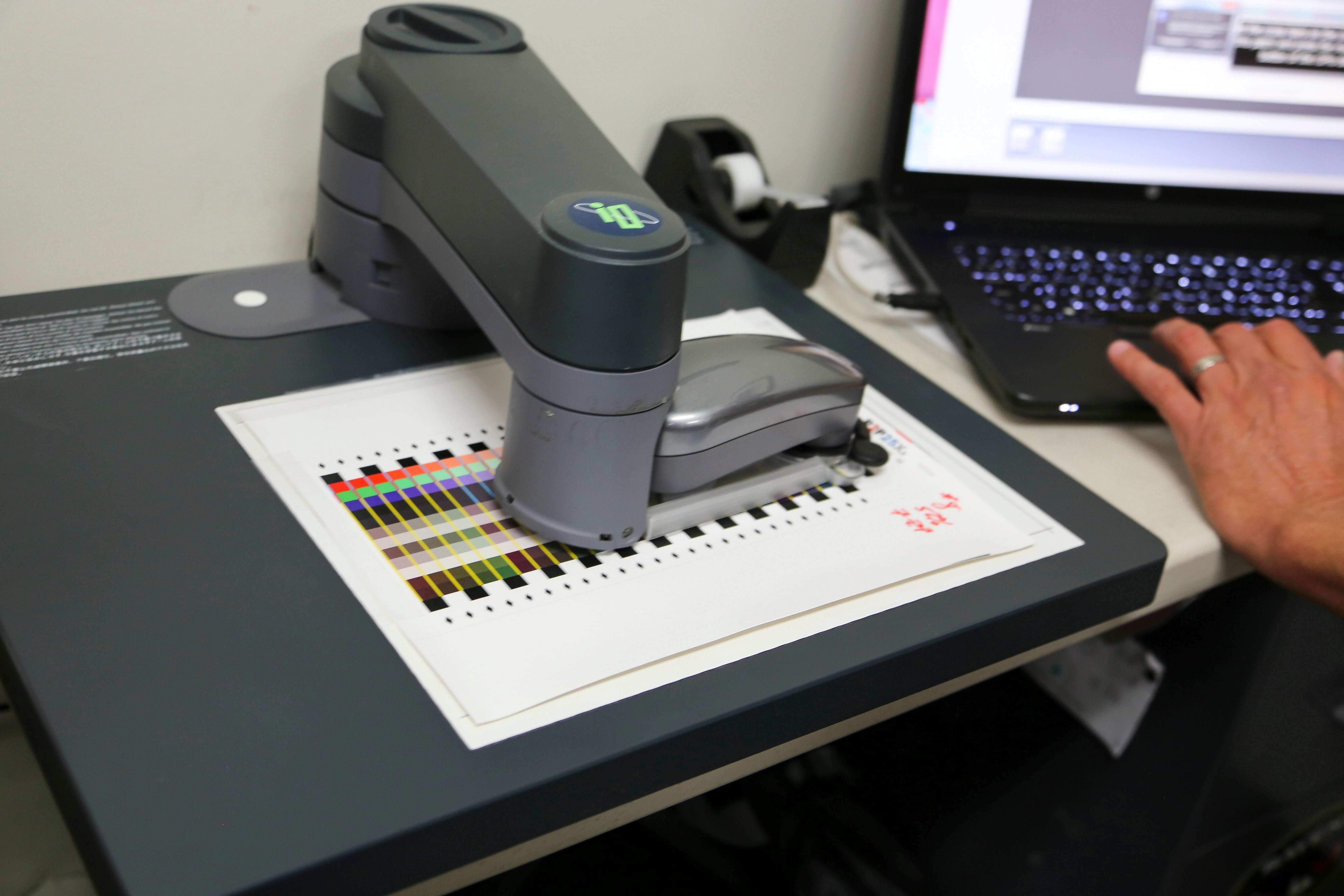
Again, there are a ton of choices out there. An important thing to remember in your software search is that they all serve the same purpose: to help us achieve neutral gray. Some software has more bells and whistles, which come with a higher price tag. Here in the lab, we use the X-rite i1 Display Pro, which costs about $250. A less expensive option is the Colormunki Smile monitor calibration ($80.00) , also by X-rite.
What really impressed me with the i1 Display Pro was the ease of the interface. Whether I was in Basic or Advanced mode, I was walked through the process, step by step. The ability to set your Luminance and Kelvin manually has been pivotal in achieving spot on color matching. Another neat feature of the i1 Display Pro is the ability to download the Pantone Library and incorporate any Pantone color into your calibration. This is very helpful for designers who need to match specific colors.
Once the calibration is complete, the i1 gives you the option to view before and after images as a visual queue to see how drastic or not the change is. The Apple displays exhibited very little change after calibration.
When deciding on calibration software, it is important to keep in mind that this is not a one-time purchase. Over time, the elements in our monitors degrade, causing a shift in color and density on screen. Thus, it's important to calibrate your monitor regularly (about once a month).
3. Keep it clean.
A dirty monitor will negatively affect your calibration results. I'm certain some of you enjoy snacking on Doritos while editing prints (who wouldn't?). It's absolutely vital to remove any cheesy fingerprints (and other smudges) from the monitor before the calibration process begins. So, pick up some monitor cleaner and a lint-free cloth. Make certain that your cleaner is alcohol and ammonia-free, and that you're using a soft cloth that will not scratch the surface of your monitor.
4. Try, try, and try again.
Now that the heavy lifting is done, the rest is about fine-tuning and tweaking to your tastes. Take time to explore your calibration software to see how different settings affect the appearance of your prints. Trust me, you will not achieve perfection on the first try, but it's easy to master with practice.
There are many variables that will change how you see your files on screen. Are you working near an open window? Do you have daylight-balanced light bulbs (NPL's daylight-balanced bulbs help us maintain accuracy in the lab)? Do you have a mix of tungsten and fluorescent bulbs? These are important factors to consider that will determine how your print will look in your viewing area.
Color correction is subjective. We're always testing our color management tools and printing systems to make sure we're producing the most accurate and highest-quality prints possible.